
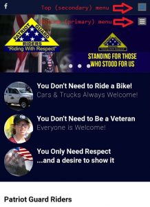
 The website is “responsive”, meaning the screen will adjust for mobile devices. For those devices that have small screens, such as phones or smaller tablets, the menu options will show as a “hamburger button” (displayed as ☰), to better enable the options to fit on the device.
Pressing the top blue icon will open the menu option that will display the login screen. Much like your full screen device, you can select an option to remember your login, saving you from having log in each time you access the site on your mobile device.
Category:
Login